
branding guide
STAND is a performing arts community where people are encouraged to discover their gifts, find their voice, and become all they were created to be.
We believe the arts are about more than what happens on a stage. When combined with our faith, the arts hold the power to build confidence, cultivate creativity, strengthen community, and give people a place to belong.
This set of branding guidelines provides the foundation for how Stand looks, sounds, and communicates across every platform and experience. From our logo and colors to our typography, photography, messaging, and overall visual identity, these guidelines help ensure that every expression of Stand feels unmistakably like us.
Whether you are creating a social media post, designing a graphic for your class, developing a presentation, or representing STAND in the community, these guidelines are here to help you create with confidence and consistency.
Our Approach
STAND’s brand is bold, energetic, welcoming, and creative, reflecting the joy and diversity of the performing arts community we serve. Our vibrant color palette brings warmth and personality to our visual identity, while our typography balances modern, approachable design with a strong, confident presence. Every element of our brand should feel intentional, unified, and unmistakably STAND while communicating creativity, confidence, community, and purpose.
Bold Vision
We dream boldly, create fearlessly, and pursue a vision that empowers people to discover their gifts and use them with purpose.
Lasting impact
We invest in people, building confidence, cultivating purpose, and creating a lasting influence that extends far beyond their time at Stand.
Brand Responsibility
When you create for STAND, you represent STAND. Protect the brand. Uphold the standard. Tell the STAND story well.
Anyone creating, designing, or communicating on behalf of STAND is expected to follow these brand guidelines. Whether you are creating a social media graphic, promotional material, presentation, email, signage, or any other public-facing content, you are representing STAND and helping shape how our community experiences our brand.
These guidelines exist to protect the integrity, consistency, and reputation of the STAND brand. Following them ensures that everything we create feels connected, recognizable, and authentically STAND—regardless of who creates it or where it is shared.
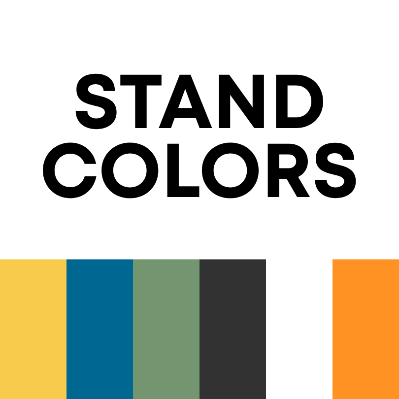
Color Hierarchy
Primary: Yellow + Blue
Accent: Orange + Green
Neutral: Black
This hierarchy helps keep STAND visually recognizable while still giving you flexibility to create colorful, dynamic materials. Focus on the primary colors; use accent colors sparingly. The neutral can be used to provide contrast, balance, and visual breathing room when the primary and accent colors need a strong foundation.
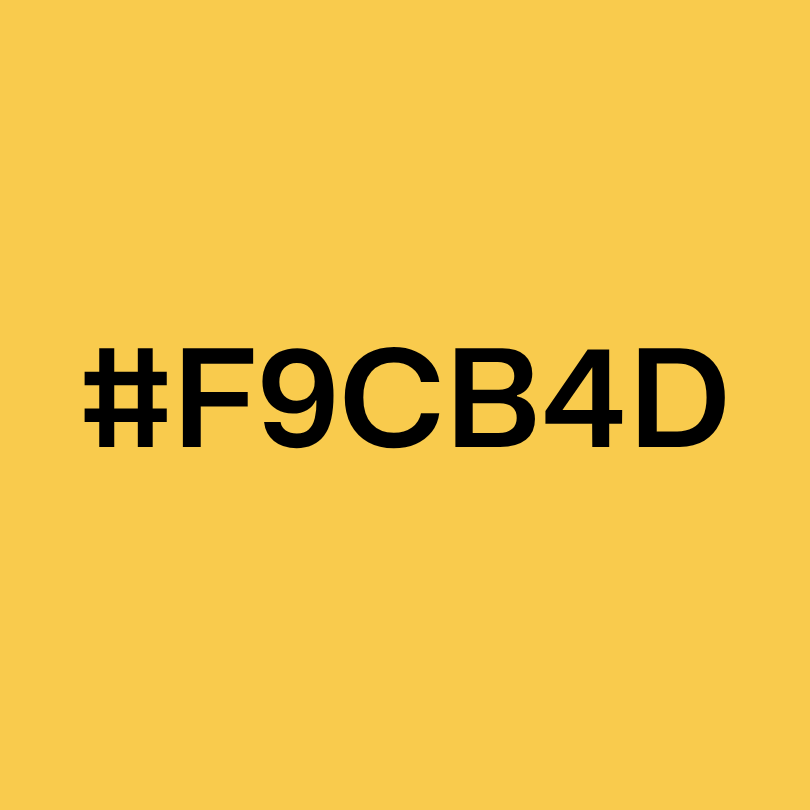
STAND Yellow -
HEX - #F9CB4D
Joyful • Bold • Optimistic
Yellow brings warmth, energy, and optimism to the STAND brand. It represents the joy and creativity at the heart of the performing arts while creating an immediate sense of welcome and possibility.

STAND Blue
HEX - #006692
Confident • Trustworthy • Strong
Blue provides stability and confidence within the STAND palette. It balances the brightness of our other colors and communicates the strength, purpose, and trust that are foundational to our community.

STAND Black
HEX - #333232
Grounding • Balance • Contrast
Black serves as our foundational neutral, providing contrast and visual balance throughout the brand. It should be used as a standard “black” for typography, backgrounds, and design elements when a strong neutral is needed—not as a primary brand color.
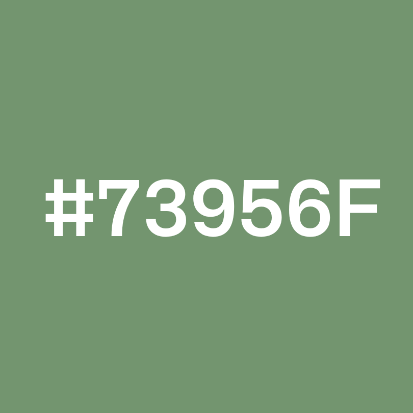
STAND Green
HEX - #73956F
Grounded • Fresh • Growing
Green brings a sense of growth, connection, and balance to the palette. As an accent color, it adds depth and a more grounded quality while representing the development of people and their gifts.
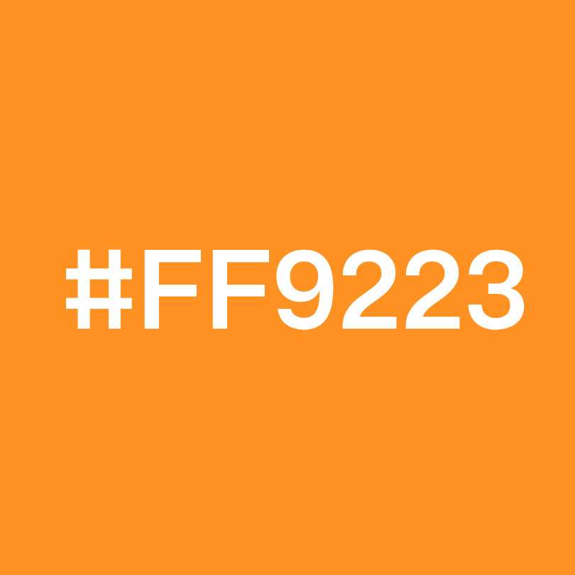
STAND Orange
HEX - #FF9223
Energetic • Creative • Vibrant
Orange adds enthusiasm and movement to the STAND brand. Used as an accent, it brings attention to important elements and reflects the bold creativity and energy of the performing arts.
Typography
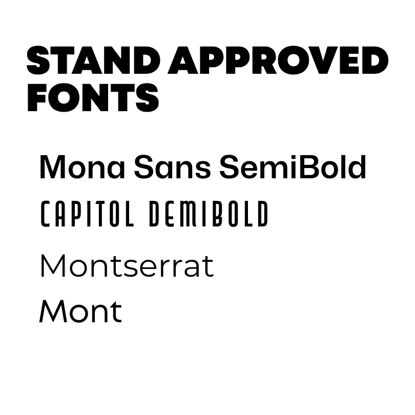
STAND’s typography balances confidence, creativity, and approachability. Our type system uses a combination of strong display fonts and clean, modern sans serifs to create hierarchy while keeping communication accessible and unmistakably STAND.
Hierarchy
When combining the fonts, think of them as a team rather than four competing typefaces:
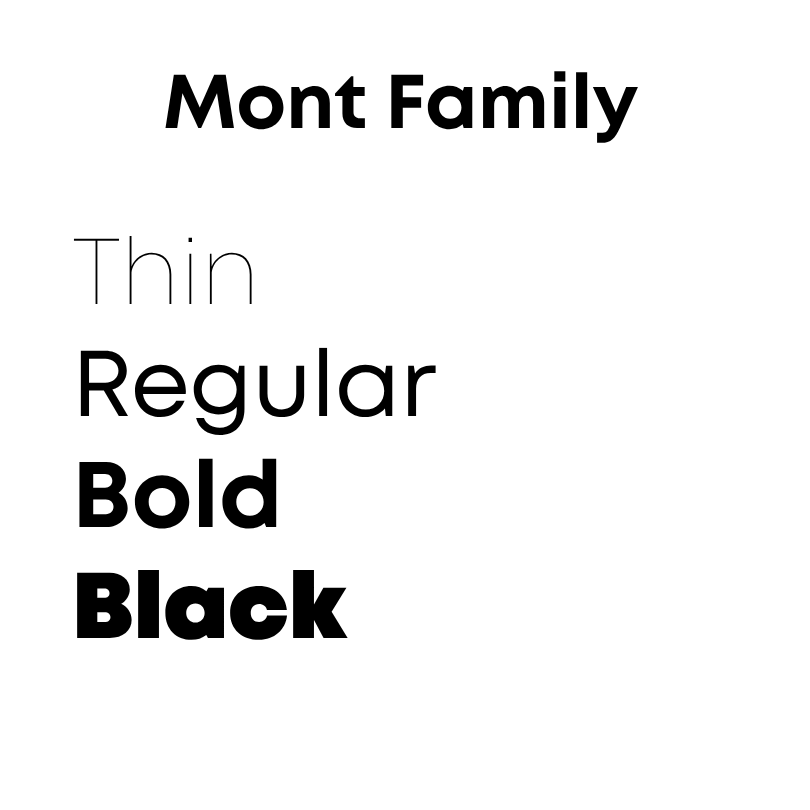
MONT
Preferred Primary Typeface
Headlines • Titles • Major Statements
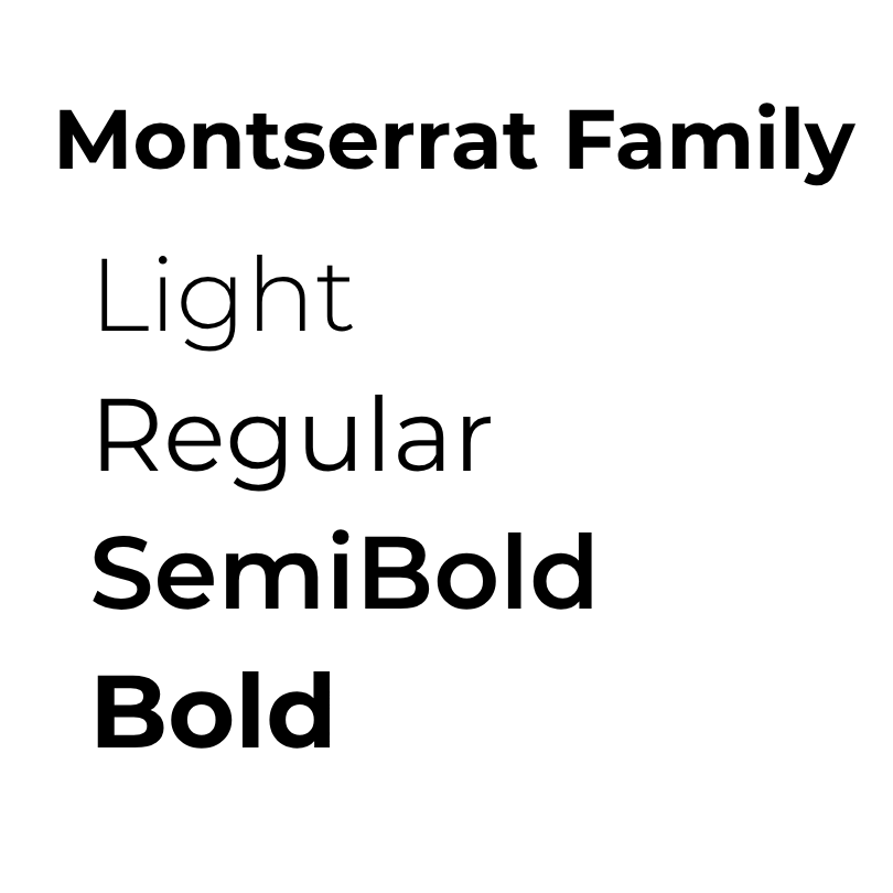
MONTSERRAT
Accessible Primary Alternative and Primary Supporting Typeface
Headlines • Subheads • Body Copy • Everyday Communication
CAPITOL DEMIBOLD
Creative Accent Typeface
Emphasis • Campaigns • Special Design Elements
MONA SANS SEMIBOLD
Functional Typeface
Digital • Labels • Buttons • Navigation
The Rule of Thumb
Lead with Mont. Support with Montserrat. Montserrat is an acceptable alternative if Mont is not available. Add personality with Capitol. Keep things functional with Mona Sans. Whenever possible, use no more than 2 fonts on any one design. Keep it simple!
STAND LOGOS
Logo Usage
Our logo system helps distinguish the different areas of STAND while maintaining a consistent and recognizable brand.
STAND Performing Arts Ministry
The STAND Performing Arts Ministry logos are the primary logo for education and classes. Use it when promoting Academy programs, classes, workshops, camps, lessons, and other educational opportunities.
STAND Performing Arts
The STAND Performing Arts logos are reserved for productions and performances. Use it on show marketing, production materials, performance announcements, programs, and other content directly related to our productions.
Logo Colors
Black is our standard logo color and should be the default whenever there is no specific reason to use color. Colored versions of the logo may be used when additional visual impact or brand personality is desired.
When placing a logo on a colored background, always use the black or white logo to maintain clarity and contrast. Never place a colored logo on a colored background. If you would like a specific logo but it is not listed here, please contact Lindsay Huffman.
The Rule of Thumb
Education - STAND Performing Arts Ministry
Productions - STAND Performing Arts
Default - Black
Color - Visual Impact
Colored Background - Black or White Logo Only
Click Image To Download Desired Logo


STAND Photography and Images

Photography is one of the most powerful ways we tell the STAND story. Our images should capture real people, real connection, and real moments, showing the energy, creativity, confidence, community, and purpose that make STAND unique.
Our Photography Style
STAND photography should feel:
Authentic, Joyful, Energetic, Connected, Inclusive, Purposeful
We want people to see themselves at STAND.
We could not do this alone. Stand partners with local professionals who help bring the story to life.
When you are selecting images to use for promotions, please maintain the appropriate photographer/videographer credit and social tags provided with the content. Do not alter, crop, or manipulate images in a way that compromises the integrity of the original work.
Chapter2Photography
Professional Photography
We partner with Ellen Kay Photography / Chapter2Photography for professional photography throughout STAND programs, productions, and events. Her work captures the people, moments, and memories that make our community special.
When sharing professional photography on social media, please credit:
Photo by Ellen Kay Photography
Instagram: @chapter.2.photography
Facebook: Chapter2Photography
Stand Photos Can Be Found Here:
Endersby Productions
Photography + Video
We also partner with Endersby Productions for photography and video content. Their work helps us tell the STAND story through both still imagery and motion, capturing the energy and impact of our classes, productions, and community.
Please Credit
Scott Endersby, Endersby Productions
Instagram: @endersbyproductions
Our Visual Standard
Whether captured by a professional photographer, videographer, staff member, or community member, STAND imagery should feel: Authentic. Joyful. Energetic. Connected. Purposeful. We aren't simply documenting what happens at STAND. We are showing who STAND is.
Using Photography in STAND Design
When incorporating photography into marketing and branded materials:
DO
Choose images that feel authentic and energetic.
Prioritize people and connection.
Allow photography to breathe within the design, do not overlap too many images or overload a design.
Use images that complement—not compete with—the STAND brand colors.
Maintain the integrity and quality of professional photography.
AVOID
Never use overly staged or generic stock photography. There is, without a doubt, a STAND image available that fills the same purpose.
Heavy filters that alter the photographer's work.
Excessive overlays or effects that make people difficult to see.
Stretching, distorting, or improperly cropping photographs.